Tuesday, December 26, 2017

Color Mixing using Munsell


Setup to paint lemon
(With help of Munsell)
The Munsell color system is the most logical color system – forget about other color systems. It defines colors by Hue (red, yellow, blue, green, blue-green, yellow-red ect.), Value (the lightness of a color; starting at 0 for a perfect black up to 10 for a perfect white – both can`t be represented by tube paints), and Chroma (purity of a color; the lower the chroma the more it tends to a neutral grey).

It is widely agreed within the realist painting community that the Munsell Color System is the most accurate way of understanding color and identifying it in context with other colors. 

All objects of nature are made visible to the sight by the light and of the sun shining upon them. The result is that by means of this we see the colors and textures of the various objects of nature. From this it may be seen that color and texture are the property of light and that they do not enter the property of the shadow. For shadow is darkness and in the darkness there is neither form nor color. Hence form and color belong distinctly to light. Shadow — as the object illuminated by the sun is more or less opaque, so when the light of the sun in obscured by that object, the shadow which results is more or less black and opaque, being illuminated only by the light reflected into it by surrounding objects. By virtue of shadow all objects of nature assume form or shape, for if there were no shadow all would be a flat glare of light, color and texture…But when the shadow appears, the object takes form and shape. If the edges of an object are rounded, then the edges of the shadow become softened; if the edges of an object are sharp, then the shadows is correspondingly acure. So, by means of the softness or sharpness of the solid object, is made manifest. Hence, it would follow that the province of shadow is to produce form and shape, and that in itself it possesses no power of conveying an impression of color or texture.”
-Howard Pyle, as quoted by Andrew Loomis, Creative Illustration, pg. 136

Sunday, December 24, 2017

Studying anatomy of figure/my favorite Anatomy reference books


Pastel on Canson paper 

This is pastel study of a male figure. I was focused on the study of the muscles. I toned a piece of Canson charcoal paper with walnut ink. I then tried to proceed with drawing in form of lines, structure, and gesture. I then built on that with modeling the figure in last stages. You can see the stages in the drawing.  I referred to my favorite anatomy reference books and I will list those if anyone is interested. 

A. Human Anatomy for Artist, Eliot Goldfinger, Oxford University Press, 1991
B. Artistic Anatomy, by Dr. Paul Richer, Watson-Guptill Publications, 1971


Thursday, September 7, 2017

Juror's Choice Award


I was so honored to have won a Jurors Choice Award for this portrait of ‘Sarah’ at Knoxville’s Broadway Gallery this month. The show was a ‘Black and White’ show in which works had to be only black and white.  My piece was second best in show and will hang all month at the Gallery.  Thanks to Broadway Galleries for making this show such fun and a great success!

Wednesday, July 26, 2017

Practicing Painting Sheres


In this example I have painted different spheres.  The bottom three are a white sphere, a #5 middle gray sphere, and a black sphere. I used my set of neutral grays to paint all of those and pre-planned the values of the darks and midtones of each prior to painting.  In doing the colored spheres I used my neutral grays for the darks and mid-tones and worked out those values beforehand also. I referred to the Reilly book to work out the values in natural light setting. You also can do this exercise by putting up the different spheres in natural light and trying to copy the values. But again you will have difficulty as I previously proved with the cubes. You have to adjust the values as I did with the cubes even in a real life setup.  These exercises really get you to understand the concept of the limits of your paint values. It also helps you to learn to paint in 3-D.  Try this!  You will learn so much!

Friday, June 2, 2017

Portrait David Tong in Graphite


Graphite drawing on Fabriano cold pressed paper

This is a graphite drawing of a young man, David Tong. I met him in Little Five Points, Atlanta and ask if I could have a picture. I found his look intriguing.  I'm drawn to details and seemed to get transfixed in trying to render the form in detail especially in a drawing. I was fortunate to get to sit near David Kassan at the Portrait Society Conference in Atlanta a few years ago watching him paint a portrait and he discussed his 'obsession' for detail also!  Guess that's why I love his work!

Wednesday, March 29, 2017

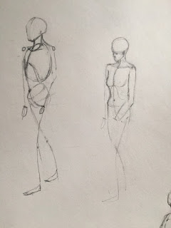
Proportions of figure


I've been doodling some portraits and wanted to learn some body proportions particularly the head.  The master of observations of human body proportions was Leonardo!  He made thousands of pages of notes and drawings on the human body. 
He wanted to understand how the body was composed and how it worked. But at his death in 1519, his great treatise on the body was incomplete and his scientific papers were unpublished. 
Based on what survives, clinical anatomists believe that Leonardo's anatomical work was hundreds of years ahead of its time, and in some respects it can still help us understand the body today.