Saturday, February 25, 2017

Mixing a set of Munsell Neutrals in Oils


My next exercise using Munsell was to make a set of neutral grays using the Munsell gray scale from the student book. Here is the process of making the neutral grays. 

1. Mix all 9 values using black and titanium white. These are your cool grays. 
2. Mix all 9 values using raw umber and titanium white.  These are your warm grays. 
3. Now starting with value 9, mix the value 9 warm gray with the value 9 cool gray until you get a visually neutral gray.  A visually neutral gray does not lean toward warm or cool.
4. Do this with all the other values. 
 
I actually made each value separately and in large amounts, then tubed them in empty tubes to use in my work!

Friday, January 27, 2017

Plotting Color on a Munsell Color Wheel


Munsell Color Wheel using oil paints


The Munsell Student Color Book and Gradon Parrish, artist and Munsell color expert, recommend as a learning exercise creating a Munsell color wheel. I have worked long and hard and have completed my color wheel (see above) following the directions in the Munsell book and from students that attended Graydon's color classes. The large color circles on the wheel represent the Munsell hues in each of the hue sets in the Munsell book at their highest chroma ( that can be obtained in paint). These colors took extensive time to mix by using the hue chips from the student color book.

The smaller color circles are colors directly from the tubes of paint colors I own. I plotted those on the wheel using my knowledge of their hue, value, and chroma and the Munsell colors chips. This exercise really helped me begin to understand the complexities of mixing colors and trying to get the correct hue, value, and chroma. It also helped me see the range of colors (color gamut) and strongest chroma I could obtain from my palette. Now with the color chips and my new color wheel, color mixing and adjusting chroma should be a little easier. Some of the great notes from the student book regarding color mixing and the 3 ways to adjust chroma will also help me when mixing a desired hue. For me Munsell color makes a lot of sense!

Tuesday, December 20, 2016

Frank Reilly and Value Scales Part 3


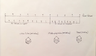
The above shows the value scale we used to find the values of our three cubes from the previous post. I have added the half tones and how they fit on this scale. Half-tones are just what they describe, half dark and half light. So if value 4 is the separation of light and dark you go out 5 units on the light side from value 4 on our scale and 5 units on the shadow side. This is where the half tones would lie. Draw an arrow straight upward to find the paint value. 


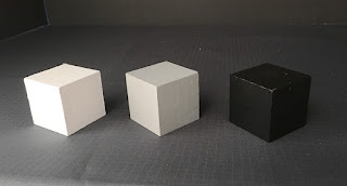
Here is a photo of my cubes but remember this time I'm not copying the values. I'm using the set values in the diagram about. 


Here is the painted result of my plotted value structure using Reilly's method in my diagram above. I found the half-tone values by using the objects local value. Let's use the #5 value cube as an example. Where is #5 on my half tone scale? Move the arrow straight upward to the paint scale. It's about value 4.5.  That is now the plotted half-tone value of the top of the #5 cube.  

I do think the blocks turned out looking pretty realistic but going forward I need to work on getting my background to better correspond with the lighting I'm using. As always step back from your work constantly to adjust things accordingly. I'm really happy to have learned a little about how this works and think I will continue my study of the Reilly method. I think it will help with planning values and using relationships in my work not just copying them.  It sure has made me see thru this experiment what is happening with objects in light and shade and the difference is the 'local' value of the object, not the object's color.  The local (home) value and the type and position of the light are, as Reilly states, is THE most important when trying to capture nature, not the local color.


Wednesday, December 14, 2016

Frank Reilly and Value Scales Part 2


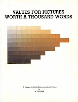
I found some of my answers I think studying these 2 excellent books (above),  Jack Faragasso, Students Guide to Painting (hard to find a copy) and A. Dorian, Values for Pictures Worth a Thousand Words (Amazon).  Both of these books teach the Reilly's system of light and shade and the way he plotted value systematically on a value scale depending on the quality and direction of the light source. 

To review, here is what we have learned so far:
A.  Nature's values are limitless
B.  Your medium of choice only has a certain value range compared to nature (0il paint has limited value range)
C.  You can't always just copy natures values like I did in part 1 of this post

So how do we create naturalistic effects with the limited value range of any medium?
According to Reilly the answer is to use value ratios.  And here is an example of what he taught and how the two resource books above demonstrate and how he plotted or planned his values. 

 Let's illustrate this: 


The value scale (above) is divided at the 4th value. (Reilly divided it at 4 with normal 'form light'.  If 
the light was more intense you could divide at #5.  You can get the books to study his explanations of the different lighting conditions). Everything in the light will be between 10 and 4. Everything in   shadow will be between 4 and 0. Now I want to point out an obvious fact from looking at the above diagram and per the Reilly books.  It is at the 4th value that a white object is in shadow and that a black object is in the light. 

Using the 3 cubes (#10 white cube, a #5 mid-value cube, and a # 0 black cube) set up in the shadow box with 'form lighting' creates objects in direct light, in half tone (half light and half shadow), and in shadow (no direct light).  But let's forget the half tones (the tops of the cubes) for the moment to simplify things.  Concentrating just on the light side and the shadow sides of these cubes let's find the paint values using the scales above.  Simply project a line upward to find the paint value from the light and shadow scales. 

Let's start with the #5 value cube. What is the paint value on the light side above # 5 (hint: draw line straight up).  Value 7!  And now what is the paint value above 5 on the shadow side?   Value 2!  Now the white cube. What is the paint value on the light side for #10?  Value 10!  What is the paint value of #10 in shadow?  Right!  Value 4!!  Black cube which is a zero value is where on the light side?  Value 4!!  And on the shadow side is 0!  Good!


This is a simple method of  keeping your objects value within a corresponding paint ratio. Say you are painting a lemon with a local value of say 8. Where does 8 fall on the above light scale?  Value 9 or near!  Where does value 8 fall on the shadow scale?  Value 31/4 or near!  Now this is very simplified explanation of what I have determined so far in studying this method.  I'm going to determine how to plot the half tones (tops of the cubes) and then I'm going to 
paint the cubes to see if these values make them look realistic. 


Wednesday, November 23, 2016

Frank Reilly and Value Scales Part 1


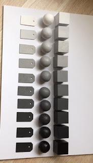
I've been trying to grasp the idea of compressing values, value relationships, and how that relates to painting for a while now. I had read and heard artist explain that you just cannot get the range of values in paints that are in nature. I had a suspicion that I mostly had been copying values in my work to this point and I wanted to see if I could improve my understanding. I used as my reference a blog I
had been following for a while. Paul Foxton over at Learning to See started studying values by using
Munsell's neutral value system and painting cubes, cyclinders, and tags with the values of the 9 step
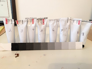
neutral gray scale.  I have done the same (see above) and made a set of my own.  I have to admit I skipped all the hard work of mixing the values in oils. I used the Golden acrylic Munsell neutral values.  I really wanted to just delve right into this and will save all the hard mixing and matching work for another day. The Golden set really surprisingly turned out very, very close to the Munsell neutral values in the Munsell student book. I could not tell any difference by sight.

Here are my tags (below) lined up to represent the value scale from lightest light to darkest dark. Most refer to this scale during reference as 10 being lightest and 0 being no light. Actually I learned that true white is not achievable in paint. Titanium white is 9.75. The same is true for black but ivory black is 0.5 on the scale where a true black (unattainable) is 0 on the scale.  So that means paint can only depict values from 0.5 to 9.75 because titanium white is the lightest paint we have and ivory black is the darkest we have.


I set up my experiment just like Paul using the black, middle gray, and the white cubes in north light
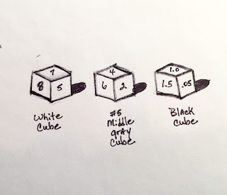
under a shadow box. I used my value tags to check the local value of each of the planes of the blocks.  I ran out of room at the black cube which is at the bottom of the scale (See diagram A).  This was an eye opener for me. This is I suspect what happens when an artist try's to 'match' values!  You would have to manipulate the vales somehow to be able to have enough room on the black cube to make it look more real.


    Diagram A

So I turned to Frank Reilly and some of his teachings about how to understand and
solve these types of problems. Reilly used a system in which values were manipulated systematically and evenly on a 10 point value scale like the one above. I had read about this system but never fully delved into it enough to determine how to apply or use it.  See what I learned from Reilly in Part 2 of
this post.

Sunday, September 27, 2015

Green apple still life


Still Life Oil


The painting was completed by first doing a drawing then a grisaille in burnt umber. I let that dry and then completed the painting. I find it very hard to set up still life’s for painting. It’s hard to get good compositions and the lighting just right.  I’m getting more used to this method and really enjoy the control of setting the value first then the color.

I recently finished a great little book, Robin Oliveira’s I Always Loved You!  It is an historical fiction based on the relationship between Degas and Mary Cassatt.  The writing is poetic in regards to the internal conflicts of an artist. Here is an excerpt from the book that I loved:

"That this striving is always on his (Degas) mind, this making a mark, this elevation of art to the sublime, the real, the relevant, the necessary. That he is unequal to the task—every day, he believes this—and doesn’t know where to place himself in the world or history or the future. That the red herring of pride interferes with real work because the real work is lines and more lines and the willingness to stand before the canvas, the sculpture, the pastel, the easel, the subject, the window, the model and construct form and shape and light and color. That such courage is only the beginning. That there is the essence of the thing that struggles to make itself known, and you don’t know what it is when you begin, that you discover it as you work. That is the secret that critics and laypeople do not understand. That nothing is clear to the artist until the art reveals itself, and it is a mystery where art resides before it is expressed, even though he can recount each step and each choice and each calculation he made; it is this riddle of art that eludes him, even as it infuses him as he works, even as he rejects it because he applies tenacious deliberation to his days and the tension between what he knows and what he doesn’t know abounds. That he doesn’t want to believe the muse exists, though she does—of course she does—for he cannot account for the music of his composition; even as he follows the golden ratio and the laws of tonality and perspective there is the in-between, wherein his brush works and color plays and it is magical and true and beguiling and it comes from him and not from him."

Friday, September 4, 2015

Meditation in Action


Oil on Linen board


We won't talk about how many paintings I tried and threw away before getting this one down pretty well!  I love flowers and need to try more of them but they are so fragile and don't really last that long, you have to work so fast or use photos!

Recently I've been contemplating why I love art and how being alone with nothing but a current piece of artwork I'm working on is like meditation.  I decided there were several reasons in no particular order why I enjoy being alone creating art!

1. Being totally present in the moment
2. Seeing and looking
3. Creating
4. Appreciation and gratitude
5. Transformative
6. Peaceful

I've felt this for a long time but I picked up a recent book about how meditative drawing can be and I think this statement in the book says it best!  "When the eye wakes up to see again, it suddenly stops taking anything for granted.  The thing I draw, be it leaf, rose bush, woman, or child, is no longer a thing, no longer any "object" over and against which I am the supercilious "subject". The split is at once de-thingafied. I say yes to its existence. By drawing it, I dignify it. I declare it worthy of total existence, as worthy of attention as I am myself, for sheer existence is the awesome mystery and miracle we share."

From Zen Seeing Zen Drawing: Meditation in Action by Fredrick Franck.