“There are moments in our lives, there are moments in a day, when we seem to see beyond the usual- become clairvoyant. We reach then into reality. Such are the moments of our greatest happiness. Such are the moments of our greatest wisdom. It is in the nature of all people to have these experiences; but in our time and under the conditions of our lives, it is only a rare few who are able to continue in the experience and find expression for it.” ― Robert Henri, The Art Spirit
Monday, May 29, 2017
Wednesday, March 29, 2017
Proportions of figure
I've been doodling some portraits and wanted to learn some body proportions particularly the head. The master of observations of human body proportions was Leonardo! He made thousands of pages of notes and drawings on the human body.
He wanted to understand how the body was composed and how it worked. But at his death in 1519, his great treatise on the body was incomplete and his scientific papers were unpublished.
Based on what survives, clinical anatomists believe that Leonardo's anatomical work was hundreds of years ahead of its time, and in some respects it can still help us understand the body today.
Saturday, February 25, 2017
Mixing a set of Munsell Neutrals in Oils
My next exercise using Munsell was to make a set of neutral grays using the Munsell gray scale from the student book. Here is the process of making the neutral grays.
1. Mix all 9 values using black and titanium white. These are your cool grays.
2. Mix all 9 values using raw umber and titanium white. These are your warm grays.
3. Now starting with value 9, mix the value 9 warm gray with the value 9 cool gray until you get a visually neutral gray. A visually neutral gray does not lean toward warm or cool.
4. Do this with all the other values.
I actually made each value separately and in large amounts, then tubed them in empty tubes to use in my work!
Friday, January 27, 2017
Plotting Color on a Munsell Color Wheel
Munsell Color Wheel using oil paints
The Munsell Student Color Book and Gradon Parrish, artist and Munsell color expert, recommend as a learning exercise creating a Munsell color wheel. I have worked long and hard and have completed my color wheel (see above) following the directions in the Munsell book and from students that attended Graydon's color classes. The large color circles on the wheel represent the Munsell hues in each of the hue sets in the Munsell book at their highest chroma ( that can be obtained in paint). These colors took extensive time to mix by using the hue chips from the student color book.
The smaller color circles are colors directly from the tubes of paint colors I own. I plotted those on the wheel using my knowledge of their hue, value, and chroma and the Munsell colors chips. This exercise really helped me begin to understand the complexities of mixing colors and trying to get the correct hue, value, and chroma. It also helped me see the range of colors (color gamut) and strongest chroma I could obtain from my palette. Now with the color chips and my new color wheel, color mixing and adjusting chroma should be a little easier. Some of the great notes from the student book regarding color mixing and the 3 ways to adjust chroma will also help me when mixing a desired hue. For me Munsell color makes a lot of sense!
Tuesday, December 20, 2016
Frank Reilly and Value Scales Part 3
The above shows the value scale we used to find the values of our three cubes from the previous post. I have added the half tones and how they fit on this scale. Half-tones are just what they describe, half dark and half light. So if value 4 is the separation of light and dark you go out 5 units on the light side from value 4 on our scale and 5 units on the shadow side. This is where the half tones would lie. Draw an arrow straight upward to find the paint value.
Here is a photo of my cubes but remember this time I'm not copying the values. I'm using the set values in the diagram about.
Here is the painted result of my plotted value structure using Reilly's method in my diagram above. I found the half-tone values by using the objects local value. Let's use the #5 value cube as an example. Where is #5 on my half tone scale? Move the arrow straight upward to the paint scale. It's about value 4.5. That is now the plotted half-tone value of the top of the #5 cube.
I do think the blocks turned out looking pretty realistic but going forward I need to work on getting my background to better correspond with the lighting I'm using. As always step back from your work constantly to adjust things accordingly. I'm really happy to have learned a little about how this works and think I will continue my study of the Reilly method. I think it will help with planning values and using relationships in my work not just copying them. It sure has made me see thru this experiment what is happening with objects in light and shade and the difference is the 'local' value of the object, not the object's color. The local (home) value and the type and position of the light are, as Reilly states, is THE most important when trying to capture nature, not the local color.
Wednesday, December 14, 2016
Frank Reilly and Value Scales Part 2
I found some of my answers I think studying these 2 excellent books (above), Jack Faragasso, Students Guide to Painting (hard to find a copy) and A. Dorian, Values for Pictures Worth a Thousand Words (Amazon). Both of these books teach the Reilly's system of light and shade and the way he plotted value systematically on a value scale depending on the quality and direction of the light source.
To review, here is what we have learned so far:
A. Nature's values are limitless
B. Your medium of choice only has a certain value range compared to nature (0il paint has limited value range)
C. You can't always just copy natures values like I did in part 1 of this post
So how do we create naturalistic effects with the limited value range of any medium?
According to Reilly the answer is to use value ratios. And here is an example of what he taught and how the two resource books above demonstrate and how he plotted or planned his values.
Let's illustrate this:
The value scale (above) is divided at the 4th value. (Reilly divided it at 4 with normal 'form light'. If
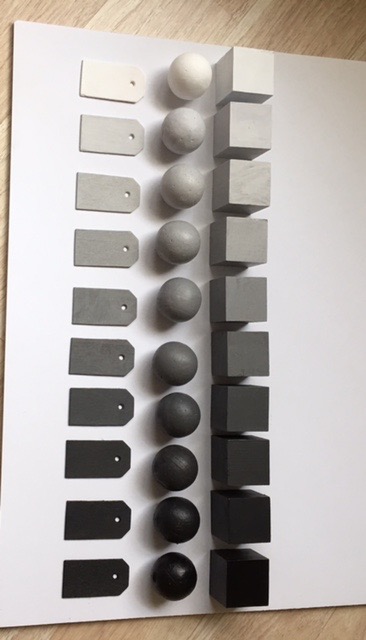
the light was more intense you could divide at #5. You can get the books to study his explanations of the different lighting conditions). Everything in the light will be between 10 and 4. Everything in shadow will be between 4 and 0. Now I want to point out an obvious fact from looking at the above diagram and per the Reilly books. It is at the 4th value that a white object is in shadow and that a black object is in the light.
Using the 3 cubes (#10 white cube, a #5 mid-value cube, and a # 0 black cube) set up in the shadow box with 'form lighting' creates objects in direct light, in half tone (half light and half shadow), and in shadow (no direct light). But let's forget the half tones (the tops of the cubes) for the moment to simplify things. Concentrating just on the light side and the shadow sides of these cubes let's find the paint values using the scales above. Simply project a line upward to find the paint value from the light and shadow scales.
Let's start with the #5 value cube. What is the paint value on the light side above # 5 (hint: draw line straight up). Value 7! And now what is the paint value above 5 on the shadow side? Value 2! Now the white cube. What is the paint value on the light side for #10? Value 10! What is the paint value of #10 in shadow? Right! Value 4!! Black cube which is a zero value is where on the light side? Value 4!! And on the shadow side is 0! Good!
This is a simple method of keeping your objects value within a corresponding paint ratio. Say you are painting a lemon with a local value of say 8. Where does 8 fall on the above light scale? Value 9 or near! Where does value 8 fall on the shadow scale? Value 31/4 or near! Now this is very simplified explanation of what I have determined so far in studying this method. I'm going to determine how to plot the half tones (tops of the cubes) and then I'm going to
paint the cubes to see if these values make them look realistic.
Wednesday, November 23, 2016
Frank Reilly and Value Scales Part 1
had been following for a while. Paul Foxton over at Learning to See started studying values by using
Munsell's neutral value system and painting cubes, cyclinders, and tags with the values of the 9 step
neutral gray scale. I have done the same (see above) and made a set of my own. I have to admit I skipped all the hard work of mixing the values in oils. I used the Golden acrylic Munsell neutral values. I really wanted to just delve right into this and will save all the hard mixing and matching work for another day. The Golden set really surprisingly turned out very, very close to the Munsell neutral values in the Munsell student book. I could not tell any difference by sight.
Here are my tags (below) lined up to represent the value scale from lightest light to darkest dark. Most refer to this scale during reference as 10 being lightest and 0 being no light. Actually I learned that true white is not achievable in paint. Titanium white is 9.75. The same is true for black but ivory black is 0.5 on the scale where a true black (unattainable) is 0 on the scale. So that means paint can only depict values from 0.5 to 9.75 because titanium white is the lightest paint we have and ivory black is the darkest we have.
I set up my experiment just like Paul using the black, middle gray, and the white cubes in north light
under a shadow box. I used my value tags to check the local value of each of the planes of the blocks. I ran out of room at the black cube which is at the bottom of the scale (See diagram A). This was an eye opener for me. This is I suspect what happens when an artist try's to 'match' values! You would have to manipulate the vales somehow to be able to have enough room on the black cube to make it look more real.
Diagram A
So I turned to Frank Reilly and some of his teachings about how to understand and
solve these types of problems. Reilly used a system in which values were manipulated systematically and evenly on a 10 point value scale like the one above. I had read about this system but never fully delved into it enough to determine how to apply or use it. See what I learned from Reilly in Part 2 of
this post.
Subscribe to:
Posts (Atom)